
For any business that wants to sell online, having a well-designed website is vitally important. Pick up any ecommerce sales or marketing strategy, and the first thing you’ll notice is that they will all talk about the importance of good web design.
As we’ve said before, your website is a digital storefront, and it’s your primary chance to make an impression on visitors.
Some of the largest ecommerce brands spend millions in tweaking their website designs to make it more appealing and to provide a seamless ordering experience.
Table of contents
Thankfully, you don’t need to spend this much money.
In this article, we’re going to cover some of the most beautiful ecommerce websites that we’ve come across, what they do right, and the thought process behind those designs.
The Best Ecommerce Website Designs of 2024
I combed through hundreds of ecommerce website designs since the start of 2024, and here’s my definitive list of the best-looking ecommerce websites.
1. Kenergy
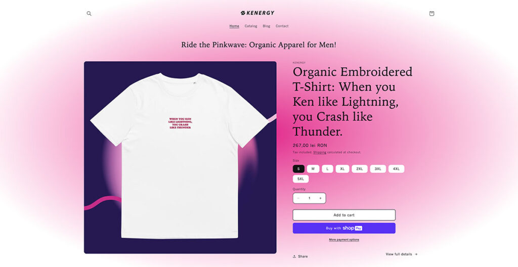
Riding hot on the waves of the Barbie movie, this is a site that can be described as “Kenough!” in many ways. There’s no home page with a slider or anything; you land on what many would confuse to be a product page.
Of course, it’s full of interesting, attention-grabbing headlines on the page, as well as distinct hues of pink (as you’d expect). They use a conventional card layout in the catalog section, showing you all of the products on offer with eye-popping blue and purple backgrounds.
They don’t have a lot of products, focusing only on essential clothing, but they present it really well.
Built using: Shopify
2. The Sill
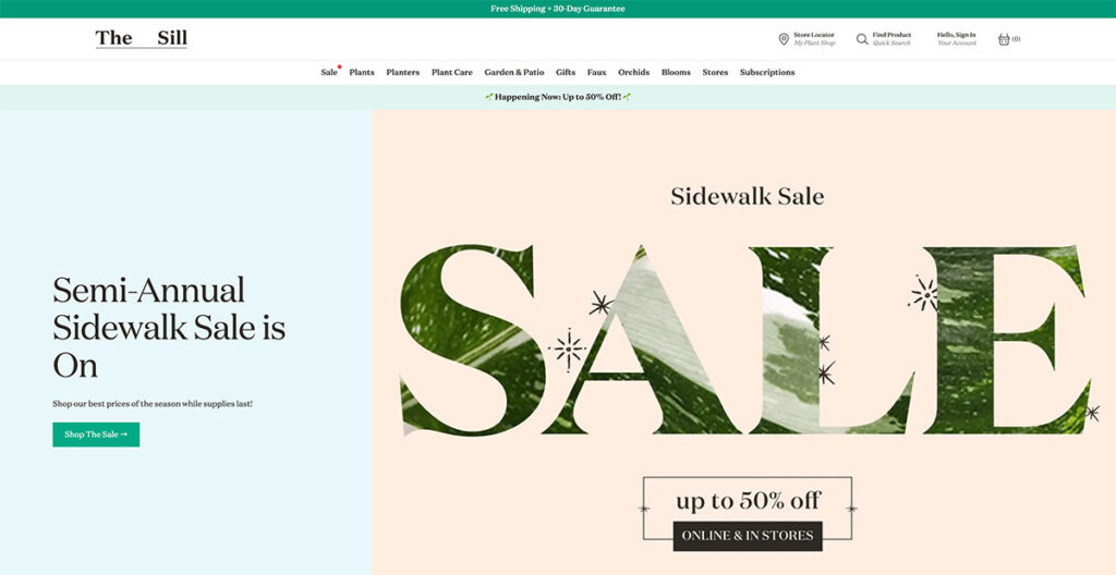
The Sill uses natural colors throughout the site, giving you a very welcoming vibe. That makes sense, because they sell plants.
Anyone with an understanding of web design knows just how difficult it is to artfully present something as basic as plants, but The Sill offers an excellent lesson.
The hero fold is regularly updated with new imagery depending upon upcoming holidays and events, and as you scroll further down, you’ll see some of their popular categories.
The buck doesn’t stop there; scroll further down and you’ll see a mix of new arrivals, pet-friendly plants, and some of their best-sellers.
The footer is tastefully laid out, with resources, account options, and essential links. They even managed to squeeze an email sign-up box in there!
Built using: Shopify
3. Couple
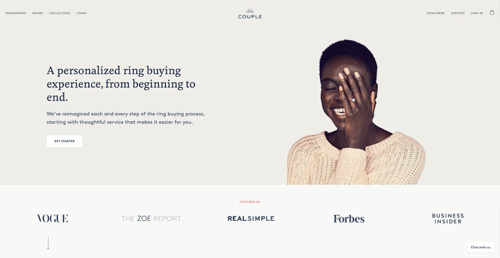
Couple does an amazing job of spreading awareness about their lab-grown diamonds, while also putting out lots of social proof on their homepage.
The hero fold has a gorgeous image of a person wearing one of their rings, so you know exactly how the actual product looks like. Just below that, you have lots of social proof with big names that have featured Couple, including the likes of Vogue and Forbes.
They also use lots of close-up imagery and have a chatbot to answer any questions you might have. This is a great touch, as users can get their questions answered almost right away.
Built using: Shopify
4. Rebecca Atwood
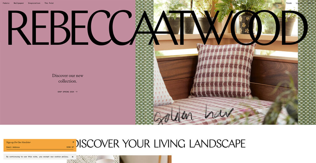
If you go to Rebecca Atwood’s site, you’ll see the big logo emblazoned right at the top. It’s bigger than conventional logos, which are usually nestled in the top-left corner, and you can’t click on it.
The use of pastel colors, and the free-flowing web design makes this an extremely attractive site right away. If you keep scrolling down, the navigation bar takes its place at the top, with some simple category buttons to match.
It’s extremely simplistic, and that’s what I like about it. You instantly get to know that they do wallpaper and dabble in fabrics, making it one of the few sites that bring out their personality through web design.
Built using: Shopify
5. Mulberry
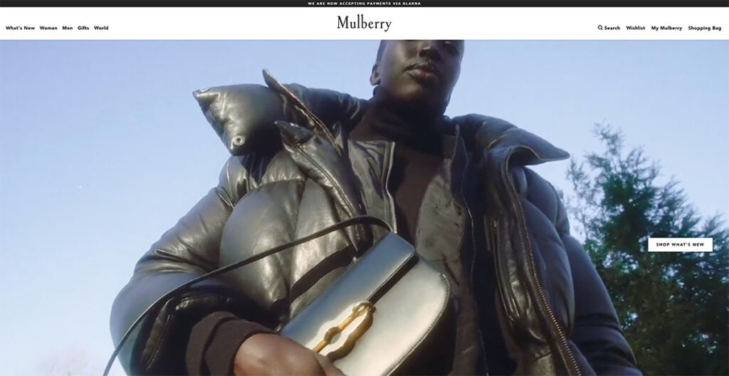
Mulberry’s design has changed significantly. They do handbags, and the site manages to strike a balance between elegance and luxury.
If you’re buying a premium bag, you don’t expect a more functional design like that of Amazon or any other ecommerce brand.
You also don’t want a site that’s overly complicated to navigate. Just hover your cursor over any of the totes, and you’ll see the image of a person wearing it; giving you a clear idea about how it looks when paired with an outfit.
It’s these subtle touches that make Mulberry the fifth entry on our list of the best-designed ecommerce sites.
Built using: You guessed it, Shopify!
6. OWL
The OWL has a welcome page which may confuse you at first. At the top, you’ll see links for a Lookbook and a Shop – fairly standard. However, click on the image and you’ll immediately see why this ecommerce site is on our list.
It’s a Swedish sunglasses brand, and instead of having a conventional footer, they place links in the sidebar. For instance, the “Login” button is placed in the sidebar, something I haven’t seen before.
As you keep scrolling down, you’ll see stunning product photography of their frames and glasses. The use of off-white is really well-done here, and definitely makes it stand out.
Built using: Shopify
7. Baronfig
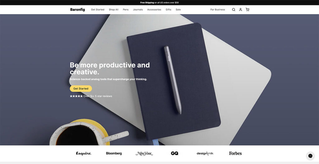
Baronfig makes pens, journals, and other “analog tools.” In a world full of Moleskines and other brands, it’s hard to stand out. Yet, the brand does just that.
Instead of just bombarding visitors with pictures of their products, they use natural placement and lots of social proof to get visitors to convert.
Just below the hero fold, you have logos of big publications that have featured the brand, and if you keep scrolling further, you’ll see some really nice product photography.
They close out the page with FAQs about the page, making sure that they tick off SEO requirements as well. Love it!
Built using: Shopify
8. Recess
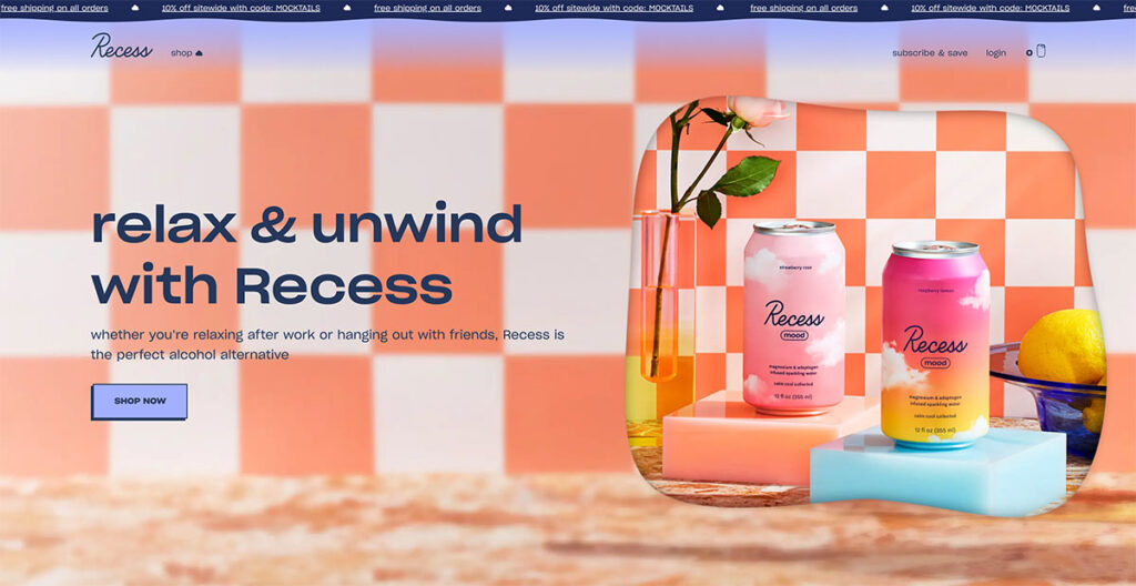
Next up, we have Recess, a colorful brand known for their alcohol-free cocktails and drinks. Their site design is a stunning departure from the other products we’ve talked about so far.
With floating clouds on the page that give a 3D effect and a dynamic top banner that highlights benefits such as discounts and free shipping, this site design really brings out the uniqueness of the brand.
They use warm colors that are easy on the eyes, from green to orange and blue, so you won’t be compelled to bounce off the site immediately.
As you scroll down, you’ll see different folds dedicated to their product line, each of which follow a similar color theme.
The whole design perfectly captures what they want customers to feel, and adds a new dimension to the brand.
Built using: Need I say it?
9. Packwire

It’s always hard to design an ecommerce site to sell boxes. Yep, literal boxes. Packwire does a great job of making a boring product seem appealing with its sharp blue and orange colors.
It uses a parallax scrolling effect, so as you scroll down, you’ll see a clean depiction of all the boxes that they offer, with buttons to customize each box to your liking (you can order custom packaging too).
I love the fact that as you scroll further down, you see step-by-step instructions on how to design custom packaging. It’s a really neat site that even has a FAQ section at the bottom.
Built using: You know it.
10. Caroline Z Hurley (CZH)
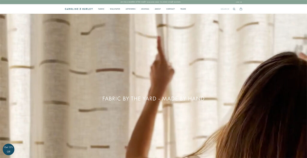
Caroline Z Hurley is an online ecommerce store that sells block printed fabric by the yard. I don’t know about you, but a product like that isn’t really going to perk my ears up.
However, take a look at their great ecommerce site, and you’ll be hard-pressed to find a better-looking competitor in this industry.
They separate each product design in neat rectangles, right on the home page. You can choose to browse through wallpapers, or go to their artworks section for a visual representation of how their wallpapers and fabrics look.
They even have a blog which really adds to the human side of the brand, as it’s run by the founders where they talk about their daily lives. Top marks all around.
Built using: Also Shopify
11. Beatific

Beatific uses digital designs and contrasting colors to showcase their journals and notebooks in a gorgeous fashion. Right off the bat, you’ll notice a video testimonial playing at the bottom.
It’s not technically “playing,” but it’s a GIF that attracts your attention (you can see the whole video review by clicking on the play icon).
Scroll further down, and you see a web counter showing how many reviews the brand has received. Since it keeps increasing, I wouldn’t put much faith in it (I saw it go from 8.4k to 8.6k in a span of five minutes), but the use of human photography to draw attention to it really felt nice.
At the bottom, there’s a full fold dedicated to a “How it Works” video. Such a nice touch.
12. Blume
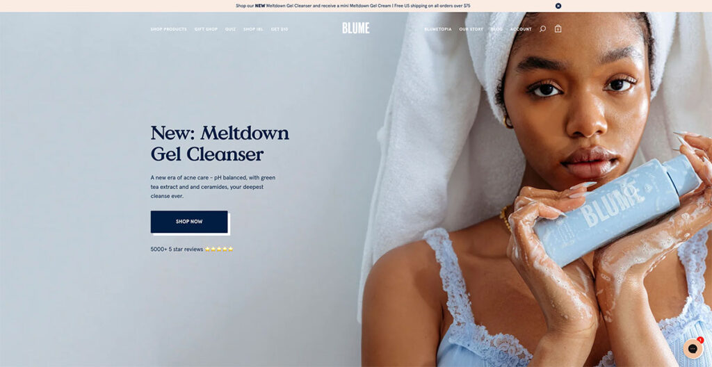
As you scroll through Blume‘s homepage, you'll see they breakdown exactly how to use and order a subscription box- making it super simple for customers to understand the process.
In Blume's case, all you need to do is choose what you want, pick how often you wish to receive one of your personalized boxes, then cancel it anytime you want- how straightforward is that?!
13. Wolf Gang
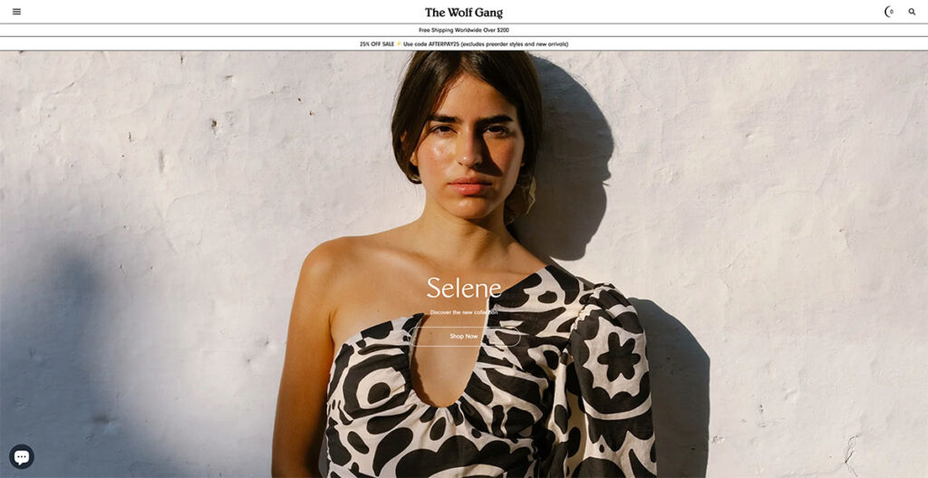
The Wolf Gang website distinguishes itself with a design that embraces shadows and weightiness, a stark contrast to the typical preference for lightness and color vibrancy seen on many other sites.
Its typography asserts itself boldly, demanding immediate attention. One aspect I find particularly ingenious is the way it simplifies navigation: a single flick of my mouse's scroll wheel effortlessly transports me to the next content section.
This feature cleverly addresses scroll fatigue, making the browsing experience smooth and engaging. The standout feature for me is this seamless section-to-section transition.
14. MSMG

MSMG stands as a quintessential showcase of vivid hues and striking imagery. The feature that caught my attention the most was the transformation of the mouse cursor into an ‘M'.
It might seem like a throwback to the '90s, and indeed, it is. However, there's a certain charm to nostalgia and retro vibes that people are drawn to.
Could this be the moment to incorporate a bit of the past into your website's design?

15. A.N.Other
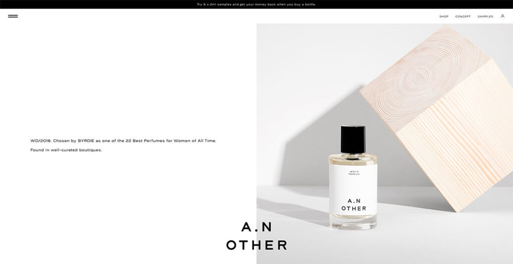
Unlike most sites that use a sticky logo at the top, A.N.Other has theirs at the bottom, ensuring the brand name remains visible regardless of where you navigate on the site.
The design strikes a balance between elegance and functionality, as its grid layout smoothly guides the viewer's gaze from one element to the next.
The website is symmetrically divided down the center, with A.N. Other innovatively rotating text and images to maintain visual interest.
This approach significantly enhances the site's appeal compared to others that lack symmetry or organization.
Built using: WooCommercemj
16. Two Chimps Coffee
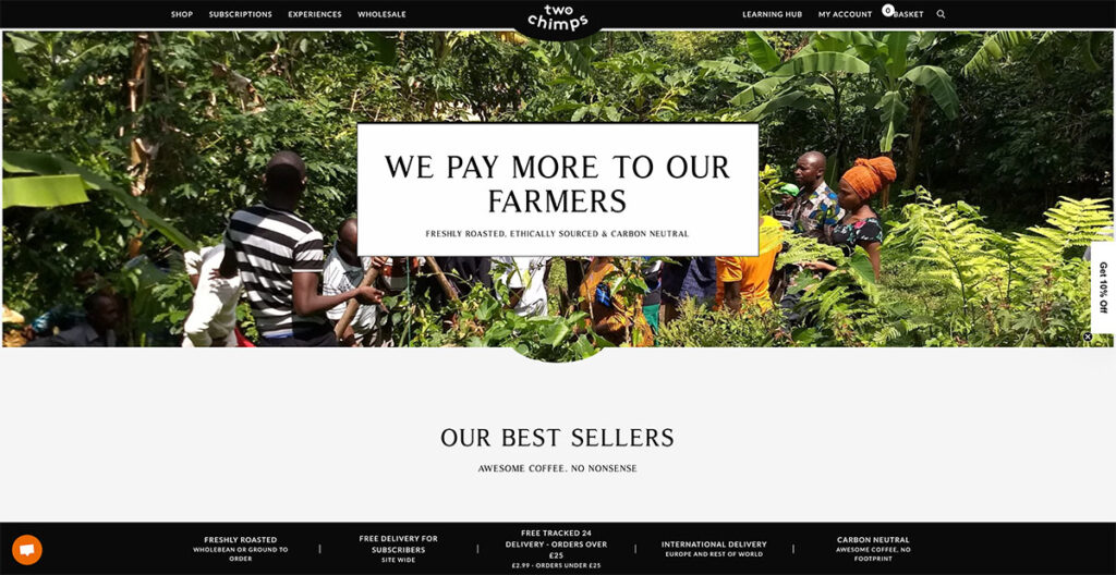
Two Chimps Coffee cleverly highlights its uniqueness through its web design and messaging, proudly announcing that their farmers are compensated better than others.
They've spiced up the common hamburger menu with a unique twist that really stands out. The site is packed with special touches that set it apart. You can see all the value props of the brand at the bottom, from its delivery options to the fact that it’s carbon neutral.
It’s quite interesting what they’ve accomplished with such a design that only leverages black and white shades.
Built using: WooCommerce
17. Not Another Bill
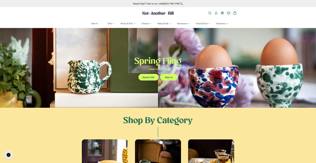
When you land on Not Another Bill's website, it's clear they're doing things differently. Their approach to design isn't just about looking good; it's about making their gorgeous, minimalist products the stars of the show.
They do this by pairing the bold colors of their items with plenty of clean, white space, which lets each product shine on its own. But what really sets them apart is how they've made shopping for unique gifts a breeze.
Right from the get-go, their homepage features a drop-down menu that's all about getting you to what you want, fast.
Want to find the perfect ‘Greeting Cards' for ‘Teenagers'? You're just two clicks away. It's this commitment to making life easier for their customers that really stands out.
The takeaway here? Keeping it simple for your shoppers can make a world of difference.
18. Package Free Shop
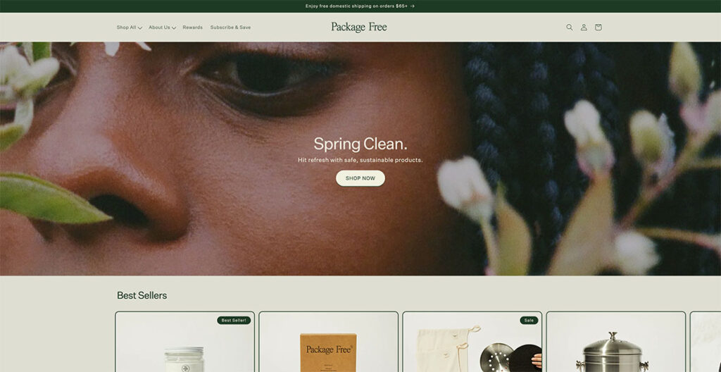
For a company that offers household essentials, the design of the Package Free Shop is nothing short of gorgeous. From dryer balls to toothbrushes, these guys make it all, and their main focus is on selling products in plastic-free packaging.
I’m automatically in favor of any brand that’s conscious of their ecological footprint, but their site design really takes the cake. They proudly announce that they offer free shipping over $25, and the use of natural, earthy colors really adds a charm to a store that sells everyday use items.
Built using: Shopify
19. Manolo Blahnik
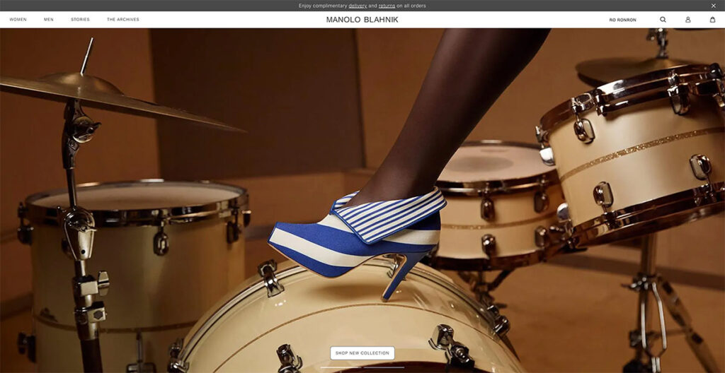
Manolo Blahnik's illustrious career of over four decades demands a website that mirrors the brand's prestige.
As you navigate through the site, the experience is akin to watching a fashion show unfold, aligning perfectly with the essence of their brand.
A standout feature is the shadow effect used behind their products, adding a layer of uniqueness not commonly seen elsewhere.
The takeaway? Incorporating a shadow effect on your product images can significantly enhance their visual impact.
20. Native Union
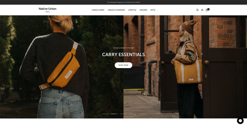
Native Union’s interactivity is elevated through the use of a sliding banner, facilitating effortless navigation across various pages. Opting for image-heavy content over text not only captivates the user's attention but also provides a more accurate depiction of the products.
With product photos taking center stage, users are left with minimal uncertainties about what's on offer. Exploring the Native Union site, the header menu intuitively brings sub-products into focus without necessitating a click.
This user-friendly feature is further enhanced by the incorporation of icons, enabling users to quickly discern the nature of what they're about to explore.
Built using: BigCommerce (surprise!)
21. Really Well Made
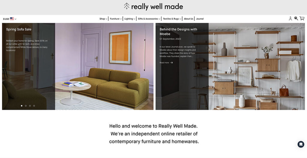
The Really Well Made website lives up to its name, offering a clean, sharp layout, without sacrificing functionality. For those seeking inspiration on how to seamlessly blend social media with their online presence, look no further.
Their homepage prominently displays their Instagram feed, serving as a brilliant strategy to bolster customer trust. One thing I really like about them is that they consistently draw attention to their blog, where they publish great content and use different call-to-actions (CTAs) too.
This not only allows them to showcase photography distinct from their product pages but also provides a space to engage in a less sales-driven dialogue with their audience.
Built using: Shopify
22. Good Moods
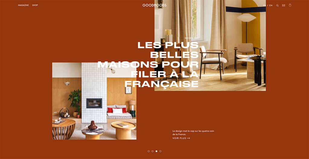
Simplicity has always been a winning factor in the world of web design. As someone who’s been following the evolution of web design since the late ‘90s, I can tell you that overly convoluted sites almost always lose visitors.
Good Moods does a great job of finding harmony between form and function, showcasing its quirky personality while also bringing attention to their high-quality furniture.
Its website dazzles with exquisite lifestyle photography that seamlessly blends vibrant hues with soft, soothing tones, creating a tranquil visual experience.
The chosen color palette whispers serenity, inviting visitors to linger and explore. With so many furniture sites to choose from, it can be a bit difficult to find your identity. Good Moods is a good example of how to do it right.
23. The Burren Perfumery
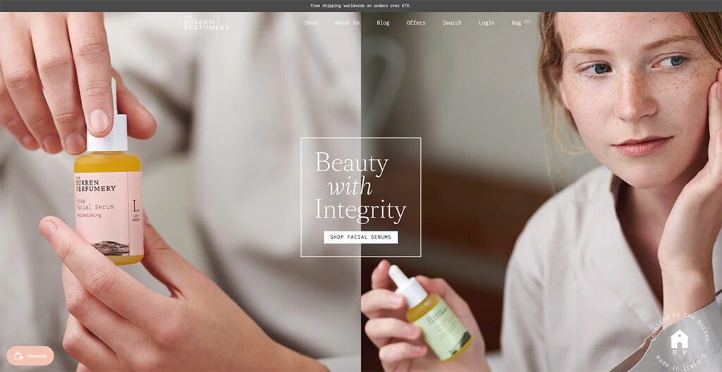
I was immediately drawn in by the Burren Perfumery's masterful use of lifestyle photography on their website.
Each image beautifully captures their perfumes' journey from creation to use, with the compositions leaving me in awe. It's not just the visuals that grabbed my attention; their choice of font is uniquely charming and adds a delightful twist to their storytelling.
Built using: Shopify
24. Via Copenhagen

Via Copenhagen's website takes a bold approach to navigation. Instead of the usual endless scroll, it switches between pages with each scroll, giving a distinct and dynamic presentation that makes every product stand out vividly.
The use of a neutral color palette enhances the elegance of the design, making the visuals even more striking. What's interesting here is the decision to forego traditional scrolling for a page-by-page transition.
This method not only captures attention but also ensures that each product is given its moment in the spotlight. I love that they replace conventional page scrolling with something new, which is why it’s on this list!
25. Save Khaki
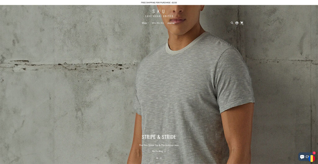
Save Khaki’s site immediately caught my attention. Their design philosophy leans heavily on using imagery that stretches across the entire width of the page, creating an immersive visual experience.
I've come across numerous articles and reports advising against the use of carousels on homepages, citing concerns over mixed messaging and a perceived lack of focus. Yet, Save Khaki's approach challenges this notion effectively.
Their carousel doesn't bombard me with conflicting messages; instead, it elegantly highlights their products being used in everyday situations.
What stands out to me is how they've managed to keep the Men's Shop and Women's Shop navigation static. This design choice allows visitors like me to effortlessly dive into shopping at any moment, a testament to the site's user-centric design.
Built using: Shopify
26. Buffy Comforters
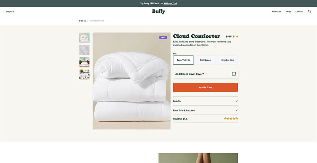
Seeing the background photo on Buffy's website, I couldn't help but think about how comfy it would be to just lounge around on one of their couches. And that’s exactly what you want to achieve from a well-designed site.
They boast of having the fluffiest, softest, and lightest comforter on the market, and their website presentation makes that claim utterly convincing. It feels like the comforter sells itself, which just speaks to their product photography.
As I started scrolling, a discount code popped up immediately. It's a straightforward tactic, sure, but undeniably effective in grabbing attention. This approach seems like a simple strategy, yet it’s remarkably efficient at enticing first-time visitors to make a purchase.
Built using: Shopify
27. Only/Once
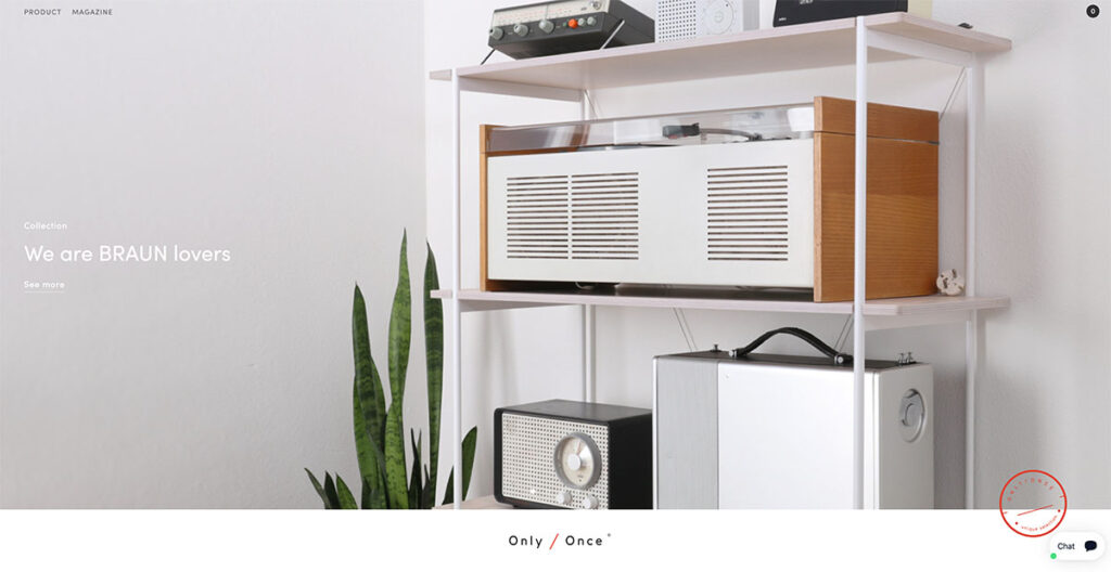
Browsing through Only/Once's website, I was immediately struck by how beautifully they showcase their vintage artifacts.
They manage to convey the distinct charm, character, and the stories behind each piece, allowing the artifacts to speak for themselves.
This approach underscores the magnetic pull of nostalgia, something that resonates deeply with me and, undoubtedly, with many others.
Only/Once's minimalist design philosophy emphasizes that sometimes, letting the products take center stage can say the most.
What Makes for Good Ecommerce Web Design
When designing a landing page, product page, or the full ecommerce site, there are certain key factors that you need to take into account. Let’s explore a few of these:=
Responsive Design
This one’s a no-brainer. Most people use their phone when browsing through the web, so you need to choose a site design that’s mobile responsive and adapts well to different screen sizes.
You should know that responsiveness doesn’t just affect how your site looks on different screens, but also impacts search rankings. Google has been prioritizing mobile-friendly sites for a while now, and it’s likely to continue.
User Experience (UX/UI)
Navigation, button placement, ease of use, these are just some of the things that affect a user’s experience on the site. When designing a site, user experience is of paramount importance.
From sliders to drop-down menus to hover effects, there are plenty of ways by which you can improve the overall user experience of your site.
It doesn’t matter if you’re using Shopify or BigCommerce or even WooCommerce, almost all major ecommerce platforms give you various options to play with.
Using Clear CTAs
In my view, clear calls to action (CTAs) are crucial in web design for several compelling reasons. They serve as direct guides, leading users from their initial interest to the desired outcome, whether that's making a purchase, subscribing to a newsletter, or downloading a guide.
This guidance eliminates any confusion, significantly improving the user experience and satisfaction on a personal level.
I've noticed that CTAs also enhance a website's usability and accessibility, making it easier for visitors of all technical abilities to navigate.
From a business standpoint, I see clear CTAs as essential tools for converting site traffic into measurable actions, directly influencing conversion rates and, ultimately, the success of the website.
To me, they're like beacons in the digital landscape, ensuring that visitors find their way and engage meaningfully with the site.
The Bottom Line
And that’s a wrap! I know this is a fairly extensive piece, but we’ve managed to cover some really interesting ecommerce website designs in 2024.
Do you have any others that you’d like to see on this list? Let us know in the comments below!


Wow, Ecommerce is the new crude. Thank you for this properly articulated post. I feel inspired
I read your blog. The information you give in the blog is very good.
👍👍👍
The information you give in the blog is very good.
Thanks!
Hey there, your article is so convincing that I can’t stop myself from saying something about it. I have 1 query. Could you please help me out with what is NoSQL in E-commerce. Thank you for sharing this beautiful article about Ecommerce Website Design.
Thank you for sharing this great piece of content. Really enjoyed reading.
You’re welcome!
Very well written blog.Thanks for sharing and too much detailed and informative for beginners.
Thanks Amanda!
Your article is very informative. You have added a lot to this content. I like this content a lot. Thank you for publishing this informative content.
👍👍👍
Thanks for the information, I am looking for the good ecommerce platforms. I am thinking to use Bigcommerce or opencart. Opencart is free so I will give a try.
Great Post!
nice article, thanks for share.
You’re welcome Dhaka!
i appreciate you for this article. you have enough knowledge on ecommerce listing. Thanks for sharing this amazing atricle.
Thanks!
Hello, I am not sure what to think about this article. The content is interesting but I found it in French and it is full of mistakes and not really readable.
Was it am automatic translation?
Hello Natacha,
For this article the translation is automatic.
Great post, It’s very informative for me. Thanks for sharing.
You’re welcome Ajeesh!
Thank you very much for this great share.
You’re welcome!
My Pleasure
https://www.exporthub.org
Great article! I did not find any mention of the Ecommerce platform used for Wolfgangstore, MSGM, Monolo Blahnik, Makr and 4254. May I know what they used? Thanks!
It looks like they are using a custom built platform.
Thank you so much for sharing these sites, it really helped me to decide the features for my site.
You’re welcome Xavier!
Thank you so much for sharing these sites, i will try to implement some of their features in to mine now!
Awesome!
Thanks a lot for this. I could borrow some designs from different websites and put it up on mine.
You’re welcome Sid!
Ive tried to take inspiration from these sites and implement some aspects in to mine….Thank you so much for sharing!
We’re really glad you found this useful Carl!
–
Bogdan – Editor at ecommerce-platforms.com
Amazing list of online store designs. Thanks for sharing with us!
You’re welcome 🙂
They all look the same!
Exactly !!